HTML Forms
Goals
- Review the evolution of forms and CGI in historical web pages.
- Understand how form submission and encoding works.
- Become acquainted with the most common form components.
- Learn how to integrate HTML forms with servlets and JSP using an MVC architecture.
Concepts
- Common Gateway Interface (CGI)
- checkbox
- control
- form validation
- HTML forms
- Model 2 architecture
- model-view-controller (MVC)
- pseudo-class
- radio button
- reassociateable
- request scope
- submit
- text area
Library
javax.servlet.RequestDispatcherjavax.servlet.RequestDispatcher.forward(ServletRequest request, ServletResponse response)javax.servlet.ServletRequestjavax.servlet.ServletRequest.getRequestDispatcher(String path)javax.servlet.ServletRequest.setAttribute(String name, Object o)javax.servlet.http.HttpServletRequest
Dependencies
javax.servlet:javax.servlet-api:4.0.1(scope: provided)javax.servlet.jsp:javax.servlet.jsp-api:2.3.3(scope: provided)javax.servlet.jsp:jstl:1.2
Lesson
The first HTML pages you saw in this course were completely static. With JavaServer Pages (JSP), you learned how to create pages with parts that were automatically generated by the server at the moment the user requests the pages. These JSP pages, based on Java servlet technology, are considered server-side dynamic pages. When the user enters the page URL in the browser address bar or clicks on a link, the browser sends an HTTP GET request to the browser. In response, the server dynamically generates a page for the browser to display.
You can pass parameters in the URL query by adding them to the link; either statically or by dynamically building a query using JSP. But HTML has a built-in facility for collecting information from the user and submitting that information to the browser, already packaged in a query. This technology, called HTML forms, does not turn your page into a full REST client, but it does provide a way to change the browser request from an HTTP GET to an HTTP POST. HTML forms provides several options for how user-entered information gets sent to the server (e.g. in URL query parameters or in the body of a POST). Thus HTML forms can be see as providing two main capabilities:
- A collection of components for soliciting input from the user.
- A way to bundle the user input as part of a query when the browser makes the request.
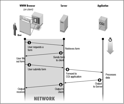
CGI
Forms have been an integral part of HTML since the early days of the web. Their use of GET and POST to send information to the server could be seen as a primitive RESTful API, and indeed you've already learned such concepts as content negotiation and sending content in a POST request when you learned how to build a REST client. But it is important to keep in mind that HTML forms existed before REST was conceived. Indeed Roy T. Felding's “representational state transfer” (REST) was a generalization of the HTTP and HTML form capabilities already in place.
When HTML forms were originally conceived, there was not such a diversity of server programs and technologies. Web servers were usually dedicated programs that listened for incoming GET requests, looked up a static HTML file based upon the requested URL path, and copied that file back to the client in HTTP response after providing some file metadata in the headers. There needed to be a way for some program on the server to process incoming data.
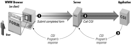
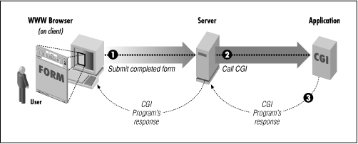
The Common Gateway Interface (CGI) was a set of informal conventions for the web server to hand off an incoming request to a program on the server for processing. A typical program for processing a POST might be written in the Perl language and placed in a cgi-bin directory of the server. When the web server detected a request to a script in the cgi-bin directory, it would start the script in a new process, pipe the HTTP request to the script's stdin (which you learned about in the lesson on the command-line interface), and then pipe the script's stdout to the HTTP response.
The overhead of creating a new script process for each incoming CGI request was inefficient. This is why later technologies such as servlets and by extension JSP because so useful, because they allowed processing of incoming requests within the server environment itself. Nowadays POST data is processed by a variety of technologies, including microservices using RESTful APIs. However you may still hear the term “CGI” and “CGI scripts” to refer to HTML form processing by the server.
Forms
An HTML form provides the enclosure for one or more controls, which accept user input. A form is defined by the <form> element, and its controls and other components are defined as child elements. To see a simple form in action, you can consider some of the most basic elements that can appear on a form.
…
  <form>
    <div>
      <label>VIN: <input name="vin" /></label>
    </div>
    <button>Submit VIN</button>
  </form>
…<label>- Represents a user interface caption for a control. Most of the time you can place the control inside the label itself. If the label appears separate from the control, you should use the label's
forattribute to indicate theidof the control with which it is associated. <input>- Creates a control for accepting user input. The specific type of control is determined by the
typeattribute. If notypeis specified, a simple text field will be used as iftype="text"had been indicated. <button>- Creates an action control rendered by the browser as a button. The
typeattribute indicates what the form behavior when the button is pressed. The valuesubmitresults in sending information to the server, while the valueresetrestores the form entry data to its original state. If notypeis specified, the button will behave as iftype="submit"had been indicated.
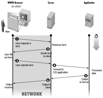
Once the form is filled with valid information, the user can click the Submit Name button to submit the form contents to the server. This invokes the CGI process shown in the sequence diagram.
The form information will be submitted to the relative address indicated by the action attribute. If the form doesn't indicate an action, as in the example above, the form will be submitted to a relative address of "", that is, to the same page address. This could be useful if the page is processed by the server—a JSP page, for example—and able to retrieve query parameters, explained below.
vehicle.jsp page for processing submitted VIN.<%@ page contentType="text/html; charset=UTF-8" %>
<%@ taglib prefix="c" uri="http://java.sun.com/jsp/jstl/core" %>
<!DOCTYPE html>
<html lang="en-US">
<head>
<meta charset="UTF-8"/>
<title>Vehicle</title>
</head>
<body>
<c:if test="${not empty param.vin}">
<p>Your vehicle identification number is ${param.vin}.</p>
</c:if>
<form>…</form> <!-- from figure above -->
</body>
</html>The form information will be sent as name-value pairs. The value entered in each control is associated with the name attribute given to the control. For example if the user enters “5GZCZ43D13S812715” as the vehicle identification number (VIN) in the form shown in the figure, the string value "5GZCZ43D13S812715" will be submitted associated with vin, which is the name attribute given to the <input> control.
Method
The form's method attribute specifies get or post to indicate whether an HTTP GET or POST request respectively, will be used to send the information. If no method is indicated, as in the example above, GET will be used by default.
The hello.jsp page in the figure shows how the above form could be embedded in a JSP page. By default the form would submit the parameter to the same page using HTTP GET. The JSP page would detect and display the submitted parameter.
Encoding
The form allows an optional enctype parameter that specifies the media type to be used for encoding the form contents, if the method attribute indicates a POST submission. There are three allowed media types.
hello-age.jsp page for showing a name and calculate age.<%@ page contentType="text/html; charset=UTF-8" %>
<%@ taglib prefix="c" uri="http://java.sun.com/jsp/jstl/core" %>
<%@ page import="java.time.Year" %>
<!DOCTYPE html>
<html lang="en-US">
<head>
<meta charset="UTF-8"/>
<title>Hello Age</title>
</head>
<body>
<form>
<div>
<label>Full name: <input name="fullName" /></label>
</div>
<div>
<label>Birth year:
<input name="birthYear" type="number"
placeholder="YYYY" max="${Year.now()}" />
</label>
</div>
<button>Say Hello</button>
</form>
<c:if test="${not empty param.fullName
and not empty param.birthYear}">
<p>Hello, ${param.fullName}.</p>
<p>You will be ${Year.now().value - param.birthYear}
years old this year</p>
</c:if>
</body>
</html>application/x-www-form-urlencoded- The content contains a single string representing the contents of the form, encoded in the following manner. This is the default media type.
- Non-ASCII characters and reserved delimiters in the names and values are encoded into a sequence of UTF-8 bytes using the form
%nn, similar to how a URI is encoded, except that a space is converted to a plus+sign. - Each encoded name and value is separate by an equals
=sign. - If there are more than one name-value pair, they are separated by an ampersand
&character.
- Non-ASCII characters and reserved delimiters in the names and values are encoded into a sequence of UTF-8 bytes using the form
multipart/form-data- Content is sent as a series of parts, each with a potentially different media type. This format is used primarily for form-based file uploads, as it is more efficient for binary data.
text/plain- Form name-value pairs are sent unencoded on separate lines, each pair separated by the equals
=sign. Because the input is not encoded, this format can be ambiguous if the input itself has delimiters such as the equals=sign.
Assume for example that the form contains both a field for a user's full name as fullName, and an additional field for entering the year of birth as birthYear, as shown in the figure If a user enters the name “José Silva” with a birth year of 2000, by default a POST will submit the information using a content type of application/x-www-form-urlencoded with the following content
fullName=Jos%C3%A9+Silva&birthYear=2000The additional features shown in this example form will be explained later in the lesson.
Form Components
HTML comes with many elements to place components on a form. Some components are used for grouping other components, while other components allow user input.
Field Set
…
<form>
<fieldset>
<legend>Vehicle</legend>
<div>
<label>VIN: <input name="vin" /></label>
</div>
</fieldset>
<!-- other controls … -->
</form>
…You can use a field set control to group components together in a section of the form with an optional label. Place the components inside a <fieldset> element. The browser will draw provide some sort of border around the components. If you add a <legend> element, the child text provides the name of the field set, which the browser usually displays somehow connected to the field set's border.
Controls
Form controls interact with the user and allow the user to input information to be submitted with the form. There are some attributes that are common to most if not all form controls.
name- Indicates the identifier to use when submitting the form information, such as
vin,fullName, andbirthYearin the examples above. value- Indicates a default value or value to be submitted for the control. (The specific use varies by control, but the general meaning is the same.) This is usually the value the control reverts to if a reset button is pressed. You may wish to populate the
valueattribute using some common value, or perhaps some calculated default value using JSP. form- Indicates the form the control is associated with if the control is outside the
<form>element. This might be used for placing a submit button somewhere else on the page, for example, to submit a form in another location. Only controls that are reassociateable support this attribute. autofocus- Designates the control to receive the focus initially when the form is displayed. This is a Boolean attribute.
disabled- Prevents any interaction with the control. Although the form still appears, it cannot be clicked or receive the input focus. This is a Boolean attribute. You can disable a group of controls if they are inside a field set by setting the field set's
disabledattribute.
<input>
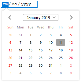
<input type="date" … />.Perhaps the most useful control, or at least the most used, is declared using the <input> element. The specific varies by what by type attribute is specified. Some types may present a simple text box while restricting the input appropriately for the type, while other types may show a specific control appropriate for the type. A prominent example is the date type, which on many modern systems will show a control for selecting a date on a calendar. The various type values currently available are shown on in the figure below, but first here are some of the common attributes used with <input>.
<input> type values.type | Description |
|---|---|
button | Renders the control as a general button |
checkbox | Provides a Boolean selection of a value. Whether the value was selected is indicated by the presence or absence of the name and value submitted on the form. |
color | A color in RGB format, with eight bits for each color component as in CSS. A browser will commonly show a color well to choose values. |
date | A local date, with no time zone. |
datetime-local | A local date and time, with no time zone. |
email | An email address, such as jdoe@example.com. |
file | Allows the user to choose a file on the local file system. |
hidden | Stores a string to be submitted with the form, but isn't displayed to the user. |
image | Creates an image button, with the image indicated by the src attribute. |
month | A year and a month, with no time zone. |
number | A numerical value. A browser typically shows spinner controls for changing the value. |
password | Similar to normal text field, but hides the input characters. |
radio | Allows selection of a single value among many. All radio controls on the form with the same name are considered part of a mutually exclusive group, and at most one selected value will be submitted for the name. |
range | A numerical value for which the relative weight is more important than the exact value. The min, max, and step attributes are useful for this type. Normally shown as a slider. |
reset | Displays a reset button. |
search | A field for designated for entering search information. |
submit | Displays a submit button. |
tel | A telephone number string. |
text | Simple text entry. |
time | A local time, with no time zone. |
url | A full, “absolute” URL, such as https://example.com/. |
week | A year and a week, with no time zone. |
type- Indicates the type of input, such as a string or a number, for restricting user input. How a platform renders the type differs by platform. For example, a mobile device may make relevant characters such as
@more readily available on a screen keyboard for theemailtype. value- The default value of the control, if given.
size- Indirectly indicates how wide the control should appear by specifying the number of characters that should be visible. If no size is specified, the size defaults to
20. multiple- A Boolean attribute indicating that multiple values are given. If specified for an email type, for example, multiple email addresses are allowed if separated by commas. Entering multiple values becomes especially useful when paired with a
<datalist>. As of 2019 modern browsers support multiple values for theemailandfiletypes. placeholder- A word or short phrase to provide a further hint about the expected input. A browser normally places this text in an empty
<input>control, removing it when the user provides any entry. A placeholder provides additional information; do not use a placeholder as a replacement for a<label>.
Data List
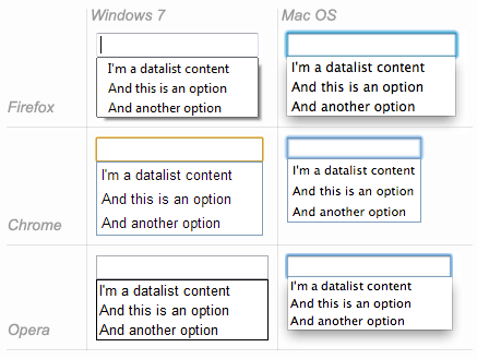
If the input field has some useful predefined values that are common for entry, you can pair it with a data list. The <datalist> element does not represent a control, but rather a list of options paired with an <input> element. Typically when a user begins typing in the input control, if a data list is associated with it a browser may display the options in the data list as a form of autocompletion, based upon what the user has entered, as shown in the figure. A data list does not restrict the input; it only provides suggestions. Check out the handy online datalist experiment to see how a data list works with various input types.
A <datalist> element contains <option> elements, each of which provide suggested data for input. Provide the suggested text inside the <option> element. Providing a label attribute will override the option display, while providing a value attribute will override the value actually used; provide both and the text content will be ignored. Browsers differ in how they display a value and a display label that are different.
Finally you must associate the data list with the control by specifying the id of the <datalist> in the list attribute of the <input> element. The following example provides a simple <input> control for entering the name of a fruit. Because of the associated <datalist> the user will see a list of choices when typing, with the options filtered by the initial letters typed. However the user can still enter a different fruit such as “mango”. Although “custard apple” will be shown as an option, if selected then “cherimoya” (the true name of the fruit) will actually be entered and used.
<select> and <option>.…
<input name="fruit" list="fruit-list"/>
…
<datalist id="fruit-list">
<option>apple</option>
<option>apricot</option>
<option>banana</option>
<option label="custard apple">cherimoya</option>
…
</datalist>
…Checkbox
The checkbox is a control that represents a Boolean choice: either selected or not selected. Normally a checkbox is rendered as a box such as ☑ with some sort of mark inside to indicate selection. Note that the <input> itself only represents the checkbox control; any label for the checkbox will need to be added separately, preferably with the <label> element. Using the <label> for attribute you can indicate which checkbox the label is for, even if the label is separated from the checkbox on the page.
A checkbox type does not submit the indicated name attribute along with the value true or false, as you might expect. Instead the checkbox expects you to supply a value attribute for the appropriate value to be submitted. If the checkbox is selected, the value is sent associated with the checkbox name. If the checkbox is not selected, no name or value for the field is sent.
<form>
<div><label>VIN: <input name="vin" /></label></div>
<div><label><input type="checkbox" name="condition" value="used"/>
Previously owned</label></div>
<button>Submit Name</button>
</form>… ☑ Previously owned …
Radio Button
A radio button is similar to a checkbox, except that it represents a mutually exclusive choice in a group of related choices. In other words, if multiple checkboxes are given the same name attribute, only one of them can be selected and included in the form submission.A radio button is normally rendered as a circle such as 🔘 with some sort of mark inside to indicate selection. A radio button is named after car radios that in the analog era: when pushing in a single button to select a radio station, the other buttons would pop out, providing mutually exclusive selection.
Imagine that a restaurant allows only one topping to be selected on a pizza. Rather than providing two checkboxes, which would allow either or both toppings to be selected, the form could provide two radio buttons to ensure that only one topping is selected
…
<div><label><input type="radio" name="topping" value="mushrooms" />
Mushrooms</label></div>
<div><label><input type="radio" name="topping" value="peppers" />
Peppers</label></div>
…… 🔘 Mushrooms 🔘 Peppers …
<textarea>
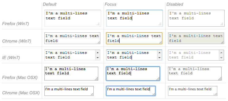
A text area control <textarea> allows entry of text, similar to <input type="text" …/ >, except that it allows multiple lines of input. Its size on the page is mostly determined by its cols and rows attributes. Most importantly the contents of the text area will be submitted as a series of lines, each separated by the CARRIAGE RETURN (CR) (U+000D), LINE FEED (LF) (U+000A) sequence, commonly known as CRLF.
cols- The number of characters (“columns”) to show horizontally in the text area. The default value is
20. rows- The number of lines (“rows”) to show vertically in the text area. The default value is
2. wrap- How the text area behaves when the user types more content than the specified number of columns, to “wrap” the lines to conform to the number of columns specified. This accepts one of two values,
softorhard. Older descriptions of<textarea>indicate that a third value,off, will prevent wrapping altogether (even soft wrapping), but this value is not included in the latest HTML specification.soft- No additional
CRLFline breaks will be added upon form submission, although the browser may wrap the lines for display. This is the default setting. hard- If any line is too long, actual
CRLFline breaks will be added to wrap long lines when the form data is submitted.
<button>
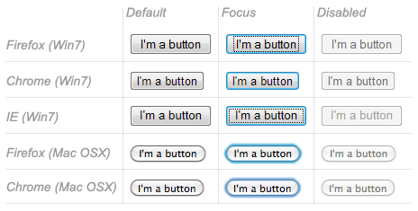
The <button> element provides a way for the users to trigger an action, and is rendered in the browser as a button that can be pressed. The button is flexible because it can show almost anything on its face, based upon the HTML you place inside the actual <button> element. What action the button takes depends on the setting of its type attribute.
submit- Submits the form, as discussed in the first example.
reset- Resets the controls in the form to their initial values. This does not deselect all radio buttons in a group, if one of them has been chosen.
button- Does nothing. A button that does nothing might seem pointless, but when you learn how to create dynamic pages with JavaScript you will be able to respond to the button being pressed and take the action you choose.
<select>
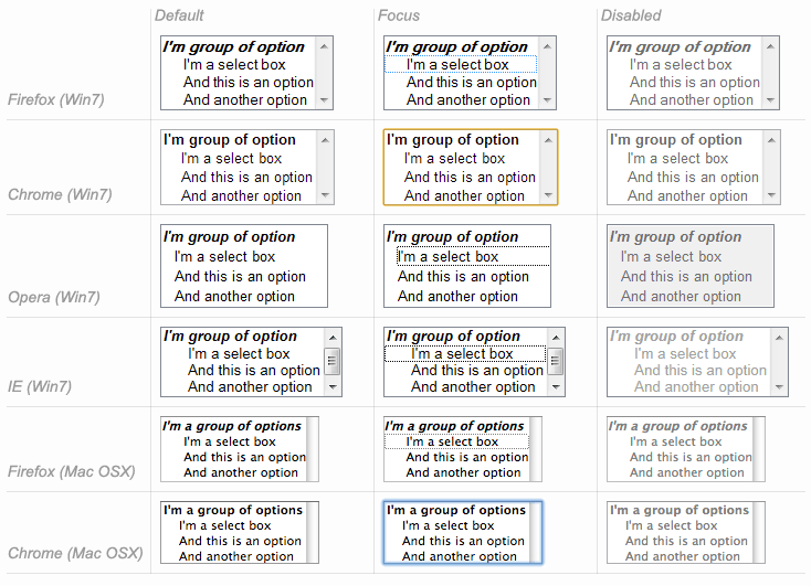
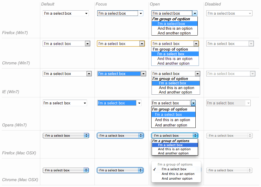
While checkboxes and radio buttons are handy for allowing the user to select from a small number of items, the HTML <select> element provides a much more compact form of displaying a longer list of options. Although a select control and a data list both provide a list of options, a select control restricts entry to the options it provides.
The select control is flexible in two areas. It can display a single option with a drop-down list of more options, or show multiple options at a time. It can also allow selection of multiple options, or be limited to a single selection. Although this would theoretically provide four combinations of settings, a multiple selection control that shows only a single option would be confusing.
multiple- Whether the control will more than one item to be selected at a time.
size- How many options to show to the user at a single time.
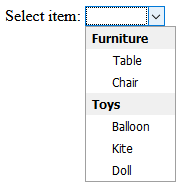
<select> and <option>.…
<label>Select item: <select name="item">
<option selected disabled hidden></option>
<optgroup label="Furniture">
<option value="table">Table</option>
<option value="chair">Chair</option>
</optgroup>
<optgroup label="Toys">
<option value="balloon">Balloon</option>
<option value="kite">Kite</option>
<option value="doll">Doll</option>
</optgroup>
</select>
</label>
…
Whether the control is shown as a drop-down list or a multiple selection list depends on the settings of its attributes: if either multiple is specified or size is greater than 1, a multiple list will be shown. Otherwise a drop-down list will be used. The actual choices shown are indicated by child <option> elements. This is the same <option> element used with <datalist>, discussed above, although the way the attributes and content are used vary slightly.
<optgroup>
If the options in a select control should be arranged in groups, you can place the child <option> elements inside <optgroup> elements. The label attribute indicates what to display when showing the group. The <optgroup> element cannot be nested.
<option>
The <option> element represents a selection, used in conjunction with another element such as <select>. The plain text contents of the <option> indicate the value to be shown in the list. The value attribute indicates the value to be sent in the form submission if the option is selected. If the value attribute is missing, the element text is submitted, even if it is an empty string.
Form Validation
Users can make mistakes entering data, and it's best to catch the mistakes as soon as possible—the principle of “fail-fast” you learned in early lessons. It would be best if the user interface prevented the user from entered incorrect data in the first place. Verifying that input is within certain guidelines before submission is called form validation. While HTML does not handle all data validation that needs to be performed, it can reduce and even prevent a number of user data mistakes by making it hard for the user to make them to begin with.
Required Fields
One of the most common and easiest ways to add validation is to indicate that a control must contain data before the form is submitted. Add the required Boolean attribute to a control element to indicate that the data is essential. A form will refuse to submit data if any controls marked as required are empty when the submit button is pressed. The browser will usually present a message indicating which required field(s) were skipped.
Input Restrictions
The various <input> element have some common attributes that allow restrictions on the range of values presented and/or accepted. The initial step, of course, is to choose the correct input type. Choosing <input type="number" …/> for example will usually prevent the user from even typing a non-digit character. In addition there are several attributes that provide more precise restrictions. Not all these attributes apply to all the input types. You'll note that some of these restrictions are on the literal entered text, while other restrictions are on the parsed value the text represents, such as a number.
max- Specifies the maximum allowed value in a range of values, such as for a number or a date.
maxlength- Specifies the maximum allowed length of content entered.
min- Specifies the minimum allowed value in a range of values, such as for a number or a date.
minlength- Specifies the minimum allowed length of content entered. For example you could require a minimum length for a password field as part of an effort to require more secure passwords.
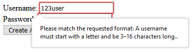
pattern- Indicates that the entire entered text must match a given regular expression. This is a more comprehensive and more powerful alternative that can combines several other approaches such as length restrictions. HTML regular expressions follow the same rules as JavaScript regular expression patterns. You can also include a
titleattribute to provide a more detailed description of the pattern for example in a tooltip, although as always with the titleattributeyou should not design the page to rely on this information always being presented. readonly- Rather than restricting the valid range of input, the
readonlyBoolean attribute prevents input altogether! Unlike with thedisabledattribute, areadonlycontrol can still receive focus and provide limited interaction without changing the value.
account.html page for registering a username and password.…
<form action="create-account" method="post">
<div><label>Username:
<input name="username" placeholder="Username" pattern="[A-Za-z]\w{2,15}" required
title="A username must start with a letter and be 3–16 characters long." />
</label></div>
<div><label>Password:
<input name="password" type="password" placeholder="password" minlength="12" required />
</label></div>
<div><button>Create Account</button></div>
</form>
…Pseudo-Classes
HTML5 supports several CSS pseudo-classes that allow special styling for controls based upon the validity of their content. You will remember that a pseudo-class is a CSS class that isn't literally included in the document, but which automatically takes its value based upon some aspect or state of the elements. A pseudo-class begins with a single colon : character.
:valid- A form or form control that has passed its validity tests.
:invalid- Matches a form control that has invalid content or a form with invalid controls.
:in-range- A control with a value that is within its prescribed range.
:out-of-range- Input that is outside its allowed range.
:required- A control marked as
required. :optional- A control not marked as
required. :read-only- A control that can be changed by users but is marked as
readonly. :read-write- A control that can be changed by users but is not marked as
readonlyordisabled. :enabled- A control that is not disabled.
:disabled- A control that is disabled altogether using the
disabledattribute.
Disabling Validation
You can disable HTML validation altogether for a form, either permanently or only when a certain button is pressed. It might seem counterintuitive to allow potentially incorrect data to be sent to the server, but there cases where you may want to send the data but not necessarily have it processed as valid by the server.
The common example is a Save button that allows information to be submitted, not for final use, but to be saved for later. This way when the user returns the server can provide the information back, even though invalid, for the user to finish editing before final submission. In such a situation you should include a name and a value with button to indicate which button was pressed, so that the server will know whether the data should be saved or processed normally. Note of course that HTML will not actually “save” the form data; it is up to the server to save the submitted data and present it later.
novalidate- A Boolean attribute on the
<form>element to turn off validation for the entire form, regardless of how it is submitted. formnovalidate- A Boolean attribute on an individual submit button, disabling validation only when that button is used to submit the form.
job-application.html page allowing saving form for later with no validation.…
<h1>Job Application</h1>
<form>
<div><label>Name: <input name="name" required /></label></div>
<div><label>Skills: <input name="skills" required /></label></div>
<div><label>Summary of work experience:
<textarea name="experience" required></textarea></label>
</div>
<div>
<button type="submit" name="submitType" value="finished">Submit Application</button>
<button type="submit" formnovalidate name="submitType" value="save">Save for Later</button>
</div>
</form>
…In the example above, selecting Submit Application will first validate the form and not submit the data unless the entered information is valid—for example, all of the required fields contain information. If the form passes validation, the data will be submitted with …&submitType=finished as part of the submission. But if Save for Later is selected, the data will be submitted even if the form state is invalid, passing …&submitType=save as part of the form data.
Model 2 Architecture (MVC)
The initial examples in this lesson showed a JSP page processing the form information submitted by that same page. That is the form on the page did not specify an action attribute; the HTTP GET request was sent to the very page that contained the form. In these simple examples the “processing” of the form submission is little more than displaying the submitted values. But in real life it is likely that processing would require more complex logic such as accessing a database, performing intricate calculations, or even making a separate request to a RESTful service.

One of the fundamental JSP best practices is that programming logic should be kept out of JSP pages, because the pages represent user presentation. Early on in the evolution of the JSP framework, the idea was born to submit form information to a separate servlet for processing the data. The servlet would then forward the HTTP request to some JSP page for presenting the results. Under this model, which an early version of JSP called the Model 2 architecture, the servlet serves as an additional layer of indirection in order to consolidate data processing outside the JSP page.

You might notice that “Model 2” architecture is nothing more than the famous model-view-controller (MVC) pattern you looked at in an earlier lesson on graphical user interfaces. A Java servlet serves as the controller, processing the form that the web browser submits to it. Once the servlet is finished with processing, it forwards to some JSP page: either the original page that submitted the form, or a separate page just for displaying the results.
Remember that objects placed in request scope will be available to all objects in the servlet container for the duration of the HTTP request. This means that the controller servlet, after processing the form input and producing some results, can place those results in a request-scope object so that they will be available to the JSP view! Within a servlet request-scope objects are accessed via javax.servlet.ServletRequest and its subclass javax.servlet.http.HttpServletRequest. Objects can be placed in the request scope using ServletRequest.setAttribute(String name, Object o).
Once the controller servlet has made the result data available via request-scope attributes, the servlet can forward the current HTTP request to the JSP view using a javax.servlet.RequestDispatcher. Retrieve a request dispatcher from the servlet request using ServletRequest.getRequestDispatcher(String path), indicating the path of the servlet or JSP page to which you wish to forward. Then forward the request using RequestDispatcher.forward(ServletRequest request, ServletResponse response), passing the current request and response objects. The servlet container will forward the current request to the new servlet/JSP, as if the form had originally had been submitted there—except that now the request contains processing results ready for the JSP to display immediately.
The following example allows the user to enter a stock value for checking low warehouse inventory. The form submits this value to a “controller” servlet which accesses the warehouse database or repository. The servlet loads the appropriate values, places them in a request scope attribute, and forwards the request to a JSP “view” page to display the results.
check-inventory.html page for submitting low-inventory check via post to query-inventory servlet.…
<h1>Check Low Inventory</h1>
<form action="query-inventory" method="post">
<p>Enter the number of items for low inventory alert.</p>
<div><label>Low Stock:
<input name="maxStock" value="15" type="number" min="0" required
placeholder="max stock considered low" /></label>
</div>
<div>
<button type="submit">Check Inventory</button>
<button type="reset">Reset</button>
</div>
</form>
…InventoryServlet.java “controller” servlet mapped to query-inventory for checking low inventory.…
@WebServlet("/query-inventory")
public class InventoryServlet extends HttpServlet {
private static final long serialVersionUID = 1L;
@Override
protected void doPost(final HttpServletRequest request,
final HttpServletResponse response) throws ServletException, IOException {
//TODO connect to warehouse database or repository
Stream<ItemStock> inventory = Stream.of(new ItemStock("table", 20), new ItemStock("chair", 15),
new ItemStock("balloon", 99), new ItemStock("kite", 5), new ItemStock("doll", 10));
final String maxStockString = request.getParameter("maxStock");
if(maxStockString != null) {
final int maxStock;
try {
maxStock = Integer.parseInt(maxStockString);
} catch(final NumberFormatException numberFormatException) {
//TODO log error
response.sendError(HttpServletResponse.SC_BAD_REQUEST, "Max stock requested was not a number.");
return;
}
inventory = inventory.filter(item -> item.getStock() <= maxStock);
}
request.setAttribute("lowInventory", inventory.collect(toList()));
request.getRequestDispatcher("inventory-results.jsp").forward(request, response);
}
}
…inventory-results.jsp “view” page for showing the result of the inventory query.<%@ page contentType="text/html; charset=UTF-8" %>
<%@ taglib prefix="c" uri="http://java.sun.com/jsp/jstl/core" %>
<!DOCTYPE html>
<html lang="en-US">
<head>
<meta charset="UTF-8" />
<title>Warehouse Inventory</title>
</head>
<body>
<h1>Warehouse Inventory</h1>
…
<h2>Low Inventory Items</h2>
<ul><c:forEach var="item" items="${lowInventory}">
<li><c:out value="${item.name}" /> (${item.stock})</li>
</c:forEach></ul>
</body>
</html>Review
Gotchas
application/x-www-form-urlencodedis not the same as URI encoding. Although it encoded many special characters using the same%nnto represent each byte of UTF-8, the space character is represented as a plus+sign, not%20as used in URI encoding- The servlet 4 specification indicates an incorrect decoding charset for
application/x-www-form-urlencodedform submissions. To prevent corrupted form data you must set<request-character-encoding>UTF-8</request-character-encoding>in yourWEB-INF/web.xmlfile. - Form validation is helpful and necessary, but it is not sufficient. You must validate all incoming data on the server as well.
- The
:invalidpseudo-class will select elements as soon as they are “invalid”, which for required input means as soon as the page is loaded, before any user input.
In the Real World
In this lesson you learned that the outdated servlet specification version 4 requires that application/x-www-form-urlencoded escape sequences be escaped as if they were ISO-8859-1 character bytes. However modern browsers, following the HTML5 specification and best practices, use UTF-8 for for escape sequence bytes when submitting application/x-www-form-urlencoded form data. As per the servlet specification, you can work around this problem by specifying that the servlet container should interpret the escaped bytes as UTF-8 using the following in your WEB-INF/web.xml file:
…
  <request-character-encoding>UTF-8</request-character-encoding>
…Unfortunately the latest version of Eclipse—currently Eclipse Enterprise Java Developers 2019-03 M1 (4.11.0 M1)—does not recognize the <request-character-encoding> setting and will temporarily freeze the IDE and generate errors with any edit of web application files. You can track the latest status of this problem at Eclipse Bug 543377. In the meantime, you can configure Tomcat to interpret application/x-www-form-urlencoded escape sequences using UTF-8 by adding a org.apache.catalina.filters.SetCharacterEncodingFilter servlet filter with its encoding initialization parameter set to UTF-8, and then mapping that filter to all URL patterns. This is accomplished most easily by editing Tomcat's conf/web.xml file and enabling (by removing comments) the sections related to the filter named setCharacterEncodingFilter:
…
  <!-- A filter that sets character encoding that is used to decode -->
  <!-- parameters in a POST request -->
  <filter>
      <filter-name>setCharacterEncodingFilter</filter-name>
      <filter-class>org.apache.catalina.filters.SetCharacterEncodingFilter</filter-class>
      <init-param>
          <param-name>encoding</param-name>
          <param-value>UTF-8</param-value>
      </init-param>
      <async-supported>true</async-supported>
  </filter>
…
  <!-- The mapping for the Set Character Encoding Filter -->
  <filter-mapping>
      <filter-name>setCharacterEncodingFilter</filter-name>
      <url-pattern>/*</url-pattern>
  </filter-mapping>
…
Self Evaluation
- What is biggest difference between URI encoding and
application/x-www-form-urlencodedencoding? - Can you place form controls outside of the
<form>element? - How does a checkbox control send a Boolean value in a form submission?
- What happens if multiple checkboxes on a form share the same
nameattribute, and more than one of them is selected? - What are the differences between using
<button>and<input type="button" … />? - What is the difference between a data list and a select control?
- What serves as a “controller” when using JSP with the MVC architecture?
- Is it possible to use the page containing the initial form as the “view” in the MVC architecture?
Task
In your Booker online search page, provide a form above the list of publications for searching for a title or a publisher.
- Add a field for typing the name of a publication for typing a name.
- Provide a suggested list of common publications and publishers that will appear as suggestions. Include neither all publications nor all publishers in the suggestion list.
- Include some interesting placeholder.
- The search name field must be required.
- Include two radio buttons: one for searching for the publication name and another for searching for the publisher.
- Provide both a submit button and a reset button. You can use whatever labels you feel appropriate.
- Implement form submission so that it actually performs the search and displays the results using the MVC architecture.
- Submit the form to a servlet that will perform the appropriate search using the actual repository configured for your web application, accessing your PostgreSQL database.
- Perform the search so that it finds the request name or publisher as a case-insensitive substring (i.e. the entire name is not required). You may update your repository interface and implementations as necessary to accomplish this.
- Your implementation must support non-Latin characters.
- Your implementation must match characters without regard to accents and other marks.
- Use the same search page containing the form for viewing the results.
- If the page is showing the results of a search, populate the search fields with default values based upon the previous search.
- Because the servlet is using the original page as its “view”, the results will be shown on the original search page but with the URL of the servlet. Have the servlet detect the absence of search parameters in case the user attempts to load the servlet directly; in that case, redirect the request back to the actual search page address.
For example, if the user searches for the name “bulletin”, the AARP Bulletin publication must be listed in the results, and the field must still contain the “bulletin” search string.
See Also
- CGI Programming on the World Wide Web (Shishir Gundavaram - O'Reilly, 1996) The first edition of CGI Programming with Perl, Second Edition, available for free online.
- HTML forms (MDN web docs)
- The native form widgets (MDN web docs)
- The Current State of HTML5 Forms (Wufoo)
References
- RFC 3875: The Common Gateway Interface (CGI) Version 1.1
- HTML 5.2 § 4.10. Forms (W3C)
- HTML 5.2 § 4.15.2. Pseudo-classes (W3C)
- Selectors Level 4 § 12.3. Input Value-checking (W3C)
application/x-www-form-urlencodedMedia Type Assignment (IANA)
Resources
Acknowledgments
- CGI Programming with Perl, Second Edition (Scott Guelich; Shishir Gundavaram; Gunther Birznieks - O'Reilly, 2000)
- HTML & XHTML: The Definitive Guide, Sixth Edition (Chuck Musciano; Bill Kennedy - O'Reilly, 2000)
- HTML5 in Action (Rob Crowther, Joe Lennon, Ash blue, Greg Wanish - Manning, 2014)
- HTML5 Unleashed (Simon Sarris - Sams, 2014)
- The Tangled Web: A Guide to Securing Modern Web Applications (Michal Zalewski - No Starch Press, 2012)
- Java Servlet Programming, Second Edition (Jason Hunter - O'Reilly, 2000)
- JavaServer Pages, Third Edition (Hans Bergsten - O'Reilly, 2009)
- CGI overview and CGI sequence diagram images from CGI Programming on the World Wide Web (Shishir Gundavaram - O'Reilly, 1996) and used with permission via email from O'Reilly Media, Inc. Legal Services Coordinator on 2019-01-18.
- Example VIN
5GZCZ43D13S812715from Wikipedia Vehicle identification number retrieved on 2019-01-11. - Car radio photo [GFDL or CC BY-SA 3.0], via Wikimedia Commons.
- Browser button, datalist, select, select multiple, and text area images from The native form widgets by Mozilla Contributors are licensed under CC-BY-SA 2.5.
- Model 2 diagram by Libertyernie2 [CC BY-SA 3.0], from Wikimedia Commons.
- MVC diagram by by RegisFrey [Public domain], from Wikimedia Commons.