Learn about different CSS units of measurement and their representations.
Understand the CSS box model.
Be able to work with CSS normal flow.
Understand the basic uses of floats and their drawbacks.
Find out how to manually position elements using CSS.
Gain an appreciation for historical bug deprecated approaches to layout in CSS.
Become experienced with the CSS flexible box layout.
Learn about the CSS grid layout.
Recognize and be able to use the CSS multi-column layout.
Concepts
baseline
block element
border
box model
computed value
content
containing block
cross axis
clearfix
em
flex basis
flex container
flex grow factor
flex item
flex shrink factor
flexbox
inline element
lobotomized owl selector
layout
length
main axis
normal flow
margin
padding
pixel
point
rem
shorthand property
unit
viewport
Lesson
Defining in CSS the style of individual elements is only one part of good presentation. The other part is specifying where those elements appear relative to each other, usually referred to as layout. CSS hasn't always had the most extensive layout capabilities, forcing users to resort to complicated tricks to achieve common layout needs. More recently, however, CSS3 modules have appeared—and are now supported by most modern browsers—that make layout straightforward and maybe even fun.
For the browser to lay out components on a page, it needs to know how large they are. By default the browser uses the size of an element's content, but at some point there will have to have been some size designation, for example indicating how large the default font is for the page. You may want to explicitly indicate the size of some element in order to make something more visually appealing or just to make a better resulting layout.
Setting a border width using pixels.
figure {
  border-width 5px;
}
Some values in CSS are simple integers or numbers, such as the <positive-number> you will see below. But for some measurements you will need to indicate the unit of measurement—whether the value 5 indicate five pixels on the screen or five typesetting points, for example.
The often you will see units with associated with measurement of distance called length, such as width or height. In CSS, a unit is expressed by a number followed by a unit code, such as 5px to indicate 5 pixels. In most cases a zero length does not need a unit, and can be expressed as simply 0.
Setting a width using percentages.
figure {
  width 20%;
}
You can also specify many values as a <percentage>, indicated by a number followed by a percent % symbol. A percentage indicates that the value is a proportion of some other value. Typically the reference value is the inherited value or the value of the parent element. For example, setting an element width: 20% would indicate that the width should be determined as 20% of the parent element's current width.
Absolute Length Units
Absolute units indicate values that will always be the same on the page regardless of the context. Because they are absolute, many of them can be converted to others using a simple formula, just as one can convert temperature from degrees Celcius to Fahrenheight. Here are two of the most common absolute units.
Pixels, the dots on the screen that make up everything displayed. In CSS a “pixel” does not always equate to a physical pixel on the screen! On some high resolution screens a CSS pixel may be made up of several device pixels so as not to to make information too small. There are roughly 96 CSS pixels per inch of the screen.
Typesetting points. There are 72 points per inch. Based upon the definitions, you can calculate that 16px is the same as 12pt, as an example.
Relative Length Units
Length units that are relative result in a size that is related to the size of something else. The resulting size actually displayed on screen is known as the computed value. Relative units are much better than absolute units, because they scale your style to the appropriate size as the display dimensions or zoom size changes.
The most famous relative unit is the em, which traditionally was equal to the width of a lowercase “m” in typography. Nowadays you can think of it as the current element's font size in pixels. A property that uses ems units will compute its value relative to the font size of the current element. Suppose you set the padding size (explained below) of a <section> element to 1.5em. If the <section> font size were 12px, it would result in a computed padding of 18px, whereas a font size of 16px would result in a computed padding of 24px. There is also a lesser-known unit ex, which is usually set to the height of a lowercase “x”.
A rem is almost identical to an em, except that a rem computes a size based upon the font size of the root element, not the current element. This results in measurements that are relative to some base document size, regardless of where the element is placed in the document.
Viewport-Relative Length Units
Other relative units specify lengths as percentages of the size of the viewport, the area of the browser window in which the content appears. Technically these units are relative to the “initial containing block”, which most often corresponds to the viewport. These units are relatively new, but can be very useful for flexible layouts. Each unit represents 1/100th of one of the viewport's dimensions. For example 20vw represents 20% of the viewport width.
CSS now supports calc(), a function for performing a mathematical calculation to arrive at a value. The function supports +, -, *, and /. Each operator must be surrounded by whitespace.You can even mix and match units. For example, you could set the width of an element to be 1em less than the width of its parent by using width: calc(100% - 1em).
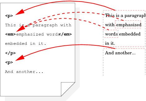
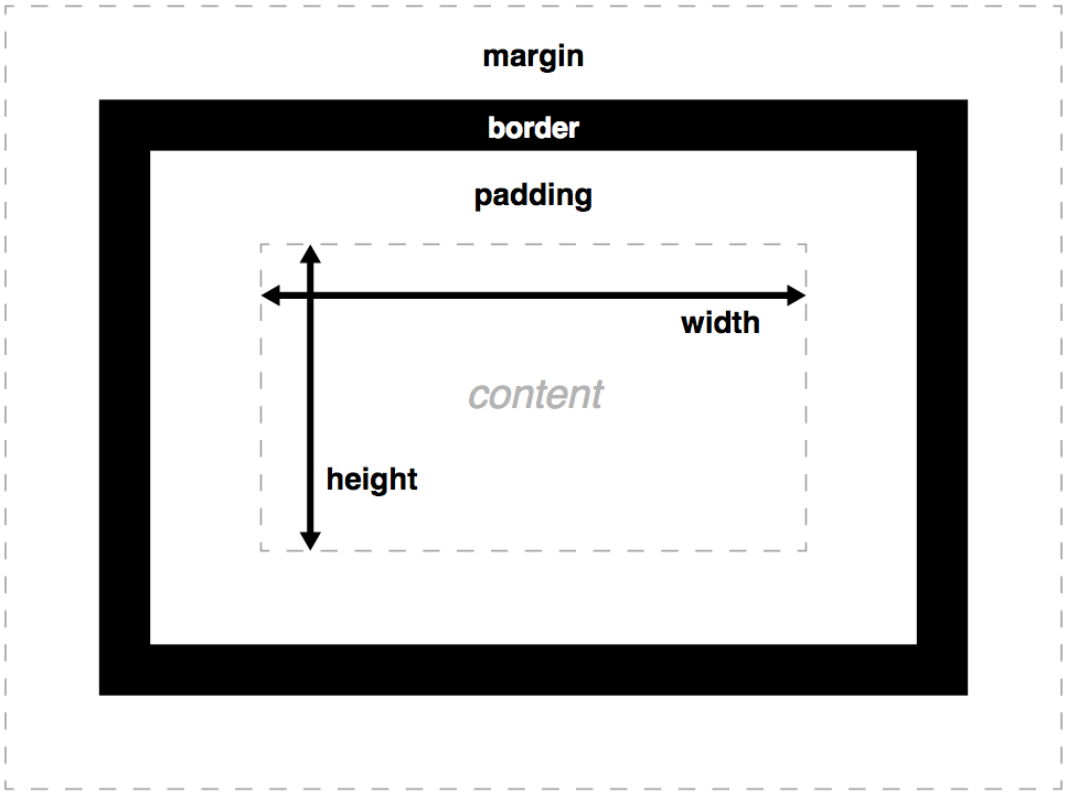
To understand CSS layout, you must first grasp the CSS box model. A CSS rendering engine will break content up into separate “boxes” which will serve as the items being laid out. Each element in the original HTML will turn into one or more nested boxes, depending how content wraps, as shown in the side figure.
Each generated box has a series of different areas, each controllable by CSS properties.
content
The area where the actual content is displayed. Controlled by width and height.
padding
The additional inner space surrounding the content but inside the border. Controlled by padding-top, padding-right, padding-bottom, and padding-left.
border
A decorative rectangle between the padding and the margin. By default the border has no size or style. Controlled by border-top, border-right, border-bottom, and border-left.
margin
The additional outer space separating the box from other boxes. Controlled by margin-top, margin-right, margin-bottom, and margin-left.
TODO explain min/max-height/width
TODO note about overflow
Normal Flow
The first step to learning CSS layout techniques is to understand the normal flow. This default layout algorithm serves as the basis for other layouts. The browser creates boxes for the elements, based upon their display type, and then lays the boxes out recursively.
The display type of an element is determined by its display property. Here are some common values, along with how they affect normal flow
block
The element is a block element. The browser makes the box as wide as the containing block, but only as tall as needed for the content it contains. (The root box is constrained only by the viewport—the browser window.) Additional block elements will appear under the current block element.
inline
The element is from an inline element. The browser makes the box only as wide and as tall as necessary for its content. The width and height properties of the element itself have no effect. Subsequent inline elements will appear beside the other inline elements, until they reach the width of the containing block and are wrapped by starting under the current row of inline boxes.
inline-block
Internally the browser lays out the box as if it were a block element, but the entire box is formatted in the flow as if it were an inline element. This means that you can control the size of the element using width and height even though it stays in the horizontal flow.
none
The browser does not create a box for the element at all. The content essentially disappears from the flow.
The browser's default style sheet already designates certain elements such as <p> and <div> has having block display. Certain elements from components such as lists and tables will get special display values such as list-item, table-row, table-column, table-cell, and the like. Otherwise elements are considered to have inline display by default, including if the element is unrecognized.
Floats
One of the simplest and oldest ways to change the flow is to “float” an element to one side or the other. Setting the float property to left or right removes the element from the normal flow and places it to left or the right of the page, respectively. The content that remains will wrap around the floated content.
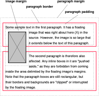
Floats were created to recreate a common layout technique seen in books and newspapers, in which article text flows around some image or figure on the side. They have somewhat fallen out of favor recently because they were being used for more complex layouts, as will be discussed later, but you can still use floats just fine for their original purpose. The figure to the left was placed using float: left.
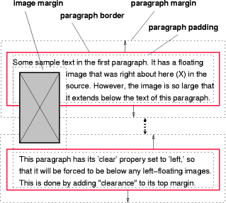
One of the problems with a float is that it may extend down vertically farther than desired, causing even unrelated content to wrap. The solution CSS provides is to mark a following element—one that should not wrap around the flow—with the clear property. This makes the designated element start a new flow only after it “clears” the previous floated elements. The clear value can be one of the following:
Don't worry about clearing floating elements. The default.
TODO add explanation of clearfix from CSS in Depth
Position
Another way to remove an element from the normal flow is to change its position property. By default an element has a position of static, which simply means the element is laid out according to the normal flow. Understanding the position value is somewhat complicated, but can result in some neat tricks.
static
The box is laid out according to the normal flow. The default.
relative
The box is laid out according to the normal flow, but you can shift the box out of its default position by using the top, right, bottom, and/or left properties. These coordinates are interpreted as relative to where the box would normally be in the flow. Negative coordinate values are allowed for the coordinates using any of the position values.
absolute
You can position the box using top, right, bottom, and/or left, which are interpreted as relative to the box's containing block. The containing block is basically the nearest parent element that has had its position set to something other than static, or the browser viewport.
fixed
Works like absolute except that once the box is positioned, the box does not move when the page is scrolled.
Layout
“Holy Grail” Layout
When the term “layout” is used it often refers to positioning of high-level sections of the entire page, such as a page banner, navigation menu, body, footer, etc. One particular layout, shown in the figure, has been called the “holy grail” because it is so difficult to implement in CSS. Between the header and footer it contains three or more columns. The left and right columns are some fixed size, perhaps relative to the page width. The middle column grows to fill the available space. One of the difficulties lies in ensuring that the three columns remain the same height regardless of content.
Layout in this sense has a long and laborious history for CSS. Only relatively recently have the CSS standards started to include more elegant layout strategies, and likewise only recently have “evergreen” browsers started to rapidly include robust implementations of these techniques. The following provides a brief overview of abandoned layout techniques, ready-to-use modern approaches, and some cutting-edge specifications that are not yet in widespread use.
TODO talk about responsive layout somewhere
Pixel Image Layout
In the extremely early days of HTML, some authors would sometimes include images with a set pixel size—perhaps a single, transparent pixel—included as many times to position an element. Needless to say this technique is more than outdated. If you want pixel-perfect positioning CSS provides more than enough precision. Do not use pixel images to position your layout.
HTML Table Layout
Even though the available CSS was not yet adequate, early browsers could render HTML <table> structures pretty well. An overwhelming number of sites started to use HTML tables for layout. After all, the “holy grail” layout could easily be achieved using a table of three rows, the middle row containing three columns, and with the top and bottom rows spanning three columns. This approach has a huge downside: it changes the content semantics; that is, it uses table elements to hold information that isn't a table. Using HTML tables for layout has been discouraged for well over a decade.
Float Layout
At some point realized that floats, which do a reasonable job of positioning blocks of content within other content, could be used to position the top-level sections of the entire site. For years floats were the workhorse of frameworks implementing the holy grail layout. Floats were not made for this level of layout, however, and it becomes tedious to work around the problems that appear. There are two major drawbacks with using floats for laying out page sections.
Floats naturally may have different heights, so it is difficult to create a series of same-height columns.
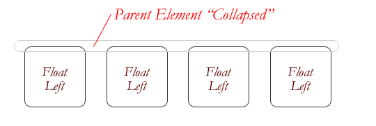
Because floats are taken out of the normal flow, they often overflow their parent boxes. In fact, if you want to create a single <div> wrapper around series of floats simply to provide a background or surrounding border, this container will “collapse” because it has no content itself—all its child content has been floated, as shown in the figure.
Although float-based page layout is still used for sites that need to support older browser, CSS now provides better alternatives that were made for the task. Flexible Box Layout, explained below, is quickly superseding float layout across the web.
Flexible Box Layout
After years of stagnation, the introduction of the CSS Flexible Box Layout, often referred to as flexbox, breathed new life into CSS layout. Flexbox has almost complete modern browser support, and has become extremely popular in recent years. Some existing libraries have even been overhauling their layout algorithms to take advantage of flexbox.
In addition to the familiar block, inline, inline-block, etc., flexbox introduces two new display values: flex and flex-inline. Either of these values will turn the element into a flex container. Because the layout direction is configurable, a flex behavior is described in terms of its main axis (the axis along which layout is occurring) and its cross axis (the axis perpendicular to the main axis). On English systems by default flex items are laid out along a horizontal main axis.
A display value of flex will make the flex container fill the entire space along the main axis, while flex-inline will only use as much space as possible. In this way the flex display values are similar to block and inline-block. The major difference is that, a flex display value switches the layout algorithm to flexbox for the child elements, referred to as flex items. The flexible box layout allows nesting, which means that each flex item can itself be a flex container!
Flexibility
How each flex item is laid out depends primarily on the setting of three properties, which can be combined using the flex shorthand property. These properties are set on each flex item, not on the flex container.
Specifies the flex grow factor, the weight for growing a flex item to fill the available space on the main axis. As shown in the above figure, a flex item with a flex grow factor of 2 will grow to be twice as wide as a flex item with a flex grow factor of 1. The special value of 0 means that the flex item will not grow. The initial flex grow factor is 0, but its default value in the flex shorthand property is 1.
Specifies the flex shrink factor, the weight for shrinking flex items when there is not enough available space. It works similar to flex-grow. The default flex shrink factor is 1, both as a standalone property and as part of the flex shorthand property.
Indicates how to calculate the hypothetical initial size of the flex item before it grows or shrinks within the flex container. This flex basis has several variations. The initial flex basis is auto, but its default value in the flex shorthand property is 0.
auto
The flex basis is determined from the width and height properties of the flex item; if not present the basis is determined from the content.
content
The flex basis is determined from the content of the flex item, regardless of its width and height properties. This value was added only recently to the Flexible Box Layout specification. See flex-basis for history.
<width>
Sets some explicit size to serve as the flex basis, using the same values as would be used for width or height.
The W3C encourages authors to use the flex shorthand property rather than the individual flex-grow, flex-shrink, and flex-basis properties, as the shorthand property's defaults allows you to accommodate some common situations.
flex: initial
Equivalent to flex: 0 1 auto. Sizes the flex items based upon their content, shrinking them as necessary, but not growing them to fill extra space. This is the flex default value.
flex: auto
Equivalent to flex: 1 1 auto. Sizes the flex items based upon their content, growing or shrinking them as needed to fill extra space.
flex: none
Equivalent to flex: 0 0 auto. Sizes the flex items based upon their content, without growing or shrinking them at all, even if there is insufficient space.
flex: <positive-number>
Equivalent to flex: <positive-number> 1 0. Grows the items proportionally within the given space, regardless of the flex item content.
Specifies the direction of the main axis. Can be row, row-reverse, column, or column-reverse. The default value row indicates the same axis as the normal inline flow, which is left-to-right on English systems. Setting the value to column on an English system would lay out the children vertically. The values ending in -reverse lay out the children in reverse order. Although the browser lays out display: block items vertically by default, using flex-direction: column ensures that the container fills the remaining vertical space.
Either nowrap (the default) or wrap, which allows the flex items to wrap around to multiple lines if they cannot fit in one row or column. If wrap-reverse is specified, the start of the cross-start axis is swapped. On an English left-to-right system, for example, the wrapped items would still run left-to-right, but the rows of items would be laid out from top to bottom.
Flex Alignment
The last detail pertains to how the flex items are aligned with each other along the two axes, after they are laid out. There are three properties to adjust the alignment at the flex container level, with several values specifically for flex.
justify-content values. (CSS Flexible Box Layout Module Level 1)
Indicates how flex items should be aligned along the main axis, should their be leftover space. The default value is flex-start.
flex-start
Places the items toward the start of the axis, with all leftover space following the items.
flex-end
Places the items toward the end of the axis, with all leftover space preceding the items.
center
Places the items in the center, with all leftover space divided on each side.
space-between
Any leftover space is distributed between the items, but not before or after them.
space-around
Any leftover space is distributed around the items, including before and after them.
Indicates how flex items should be aligned along the cross axis. The default value is stretch.align-items values. (CSS Flexible Box Layout Module Level 1)
flex-start
Places the items toward the start of the axis, with all leftover space following the items.
flex-end
Places the items toward the end of the axis, with all leftover space preceding the items.
center
Aligns the item in the center of the cross axis, with their own centers aligned.
baseline
Aligns the items along a baseline, usually calculated from the base of lines of text content.
stretch
The size of the items are stretched to make the items the same size along the cross axis.
Indicates how wrapped lines of flex content are aligned along the cross axis. This property is similar to justify-content along the cross axis.If there are no wrapped lines, this property has no effect.The default value is stretch.align-content values. (CSS Flexible Box Layout Module Level 1)
flex-start
Places the lines toward the start of the axis, with all leftover space following the wrapped lines.
flex-end
Places the lines toward the end of the axis, with all leftover space preceding the lines.
center
Places the lines in the center, with all leftover space divided before and after the wrapped lines.
space-between
Any leftover space is distributed between the lines, but not before or after them.
space-around
Any leftover space is distributed around the lines, including before and after them.
stretch
The wrapped lines stretch to take up all the space along the cross axis.
CSS Grid Layout
TODO
TODO talk about content-oriented vs layout-oriented
TODO note that flexbox is one-dimensional, and that grid layout is two-dimensional
Multi-Column Layout
The CSS Multi-column Layout Module Level 1, currently still in working draft, describes a layout system that produces a series of columns, in which content flows from one column to another much like a newspaper. This type of layout is surprisingly seldom utilized, even though it already has strong support across all major browsers.
Column specification is relatively simple; here are some of the most common column properties, which may be mixed and matched. There is also a shorthand property columns.
Specifies the amount of space to appear between the columns.
The layout algorithm takes care of many details:
The columns are made to have a consistent height.
If there is not enough content to fill the horizontal space, the columns will be made wider.
If there is too much content for the horizontal space while maintaining the minimum column width, the number of columns will be reduced, resulting in a responsive layout!
Review
Summary
Gotchas
If you define font-size for an element class using ems, nesting that element type will result in increasingly “shrinking” fonts with each level because ems are themselves relative to font size. You can get around this by defining font-size relative to the root element using rems.
If two elements are adjacent vertically, either as siblings or as a parent and child, the margins will “collapse” and the elements will share a single margin, which will be the maximum of the two original margins.
In the Real World
Boilerplate
There are several modern CSS layout tricks, discussed above in this lesson, that you may want to consider including in the boilerplate of some or all of your style sheets.


